A Detailed Overview On Making Your Site Retina-ready
Gone are the days when website imagery turned to be brilliant and non-pixelated for a range of screens. Today, with the inception of retina displays; it has become a challenge for the website creators to optimize their site’s imagery for screens with different resolutions.
What will this tutorial help you with?
Considering the urge for converting your existing website into a retina-friendly portal, I’ve written this tutorial which helps you in understanding the four simple-to-follow approaches used for the same. The best part of all these approaches is that the imagery for the website remains in-tact.
So, let’s get to know more about the 4 proven methods of converting a plain website into the retina-ready portal.
Method No.1- Use a renowned server-side solution
As the very first method on my list, you can opt for a high-quality server solution like Retina Images which would allow you to serve your website’s high-resolution images to users who choose to access your site via devices with different screen sizes.
Relying on a modified .htaccess file, PHP, enabled cookies and Javascript, Retina Images is easy to install and configure. Once you’re done with setting up Retina Images for your website, all you need to do is simply create a high-resolution image that you’d like to optimize for the retina. By specifying the height and width attributes, you are even freed from the worries of changing the <img> tags. One of the biggest advantages of this approach is that only one image is being downloaded by the viewer, with all the standard raster images(with extensions like .png, .jpg, .bmp, .gif) being served as high resolution.
Method No.2- Use Icon Fonts
Yet another brilliant method to optimize your website for retina displays is using the icon fonts which are easy to edit, maintain and can be easily scaled in accordance with your preferences. This icon font will have a much smaller size as compared to that of the image. Additionally, the icon will render on an instant basis upon loading the font, eliminating the need to wait for the image to download completely.
You can simply embed the icon fonts using @font-face in your CSS, thereby scaling them to any size, followed by a styling and animating them using CSS. Backed by excellent browser support, the icon fonts can also be equipped with impressive add-ons like rollover states, drop shadows and colors. Last, but definitely not the least, the icon fonts are well supported by all the modern and legacy browsers.
Method No.3- Use CSS Sprites
Ever since mobile devices with 2D gaming capabilities have been introduced, the CSS sprites have come back into vogue. Having been around for over eight years from now, CSS Sprites allow you to optimize the monetary and bandwidth for both, medium and large websites, in addition to enhancing the experience for end-users via a visible reduction in site’s loading time.
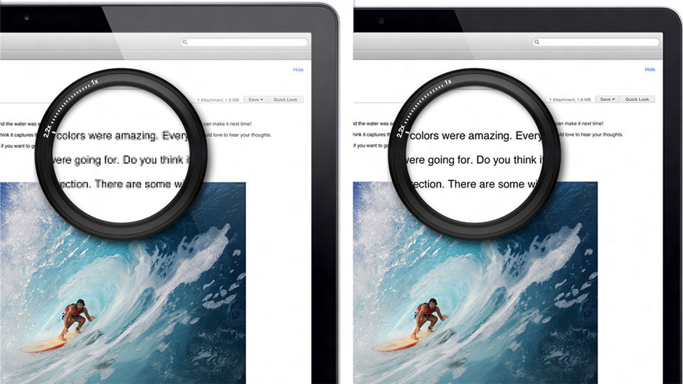
Here’s an example of using CSS Sprites
If you need to cater to your website for high-resolution displays, you’ll require two images viz: a normal resolution image @1x and a high-resolution image @2x. That would mean, you need to double the number of selectors, files and references for the images in your CSS. With CSS Sprite, you simply need to override the link redirecting to @1x sprite file available for all selectors which include high-resolution properties. All in all, the use of CSS Sprites will reduce the network requests and style-sheet file size, leading to efficient optimization of the website for retina displays. Plus, with CSS Sprites, the entire process of creating retina assets for your website becomes efficient and cleaner, pertaining to the coding part.
Method No.4- Use SVGs (Scalable Vector Graphics)
Often overlooked, SVGs(Scalable Vector Graphics) can be conveniently utilized for ensuring the retina compatibility of websites. With the use of SVGs, your website images will look crisp and sharp. The main reason being that the images are of vector form and hence use lines and shapes instead of pixels. Not to forget, the resolution independence feature and amazing scaling abilities make your vector images ready for any future technological advancements.
Although SVG isn’t appropriate for all image types, it works as the perfect match for patterns, icons, graphs, logos, navigation, maps, repeating backgrounds and maps. You can opt for using SVG either as an <object>, <iframe>, <img> or as an <embed>. A typical method is to use “inline” SVG which allows you to enjoy extensive control over individual website elements with the help of special SVG CSS. For this, all you need to do is simply fetch the XML code from the SVG and copy-paste it into your website’s HTML Document. Doing this will also cut down all the additional HTTP requests which tend to consume a lot of server space.
That’s it!
Wrapping Up
Adapting your website to retina displays has been a time-tested strategy for reaching out to a larger group of targeted consumers. I’m quite sure the information furnished above would tempt you to go ahead with the same, without any further delay.
Author Bio:
Sophia Phillips has been working as a professional in WordPress web development company and loves sharing information about leveraging multiple benefits of WordPress in the best possible manner.
Currently, she has an impressive count of WordPress development-related articles under her name.