Responsive
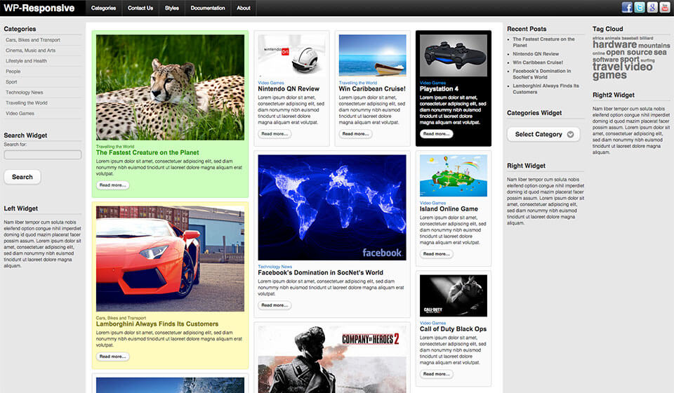
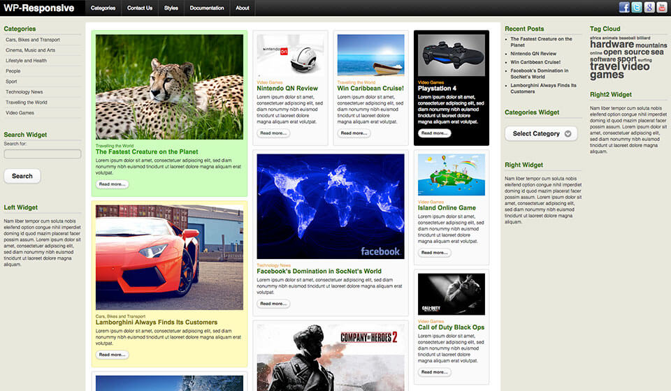
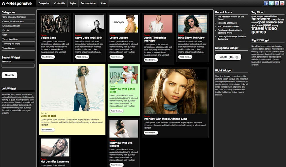
Responsive WordPress theme is a wall for publishing posts from WordPress in a form of blocks. Every block contains the post’s title and category, intro text and featured image. The size of the blocks has been determined by the sizes of the featured images.
You can create blocks of various widths. Responsive WordPress theme will arrange them automatically into the harmonious whole.
Hot Responsive WordPress theme looks simple, but under the cover, there’s a complex code that makes such an unusual way of showing the posts possible. First of all, jQuery mobile handles the top menu and all interactive elements, such as buttons, selection boxes, as well as the transition effects between the pages (if enabled). The Masonry is a jQuery plugin that is used to line up the posts like bricks in the wall. This plugin dynamically determines the available space in the user’s screen and then calculates the widths of the posts in order to maintain the proportions of the bricks and overall look of the wall. Masonry can line up the bricks in many columns in order to display more information for users with larger screens. However, it can also show only one column of the blocks (posts) for users who are visiting your site using the smaller screens, such as smartphones or tablets.
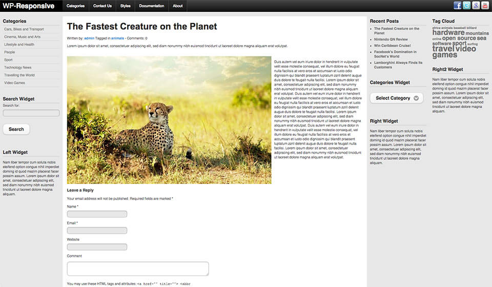
It’s worth mentioning that the same system of “the wall bricks” is used throughout your site. Not only for the front page. All categories, tag listing pages, author pages, and search results pages are displayed in the same format. Therefore, the uniformity of your site and responsive features are guaranteed if you are using the Responsive WordPress theme.
Infinite Scroll jQuery plugin has been used to replace default WordPress’ Older Posts and Newer Posts links. With infinite scroll, the first set of your posts/blocks (which number is set as usually in WordPress Configuration – Reading) will be shown first. When a visitor scrolls the page down, as soon as s/he reaches the end, the new set of posts/blocks will be loaded. So, there’s no need to click anywhere. Reading the information from the “wall” is fluid and uninterrupted.
Responsive WordPress theme uses a handy feature of WordPress: Custom fields. They are used when some bricks should be colored differently. You probably noticed that some blocks on our demo are colored differently. For this purpose, a custom field named ‘color’ should have an appropriate value set, for example ‘green’. Also, if some posts contain text only, their width can be set by making a custom field named ‘width’ with value inside. In an example, ‘dynlayout_wide2’ (the number can be from 1 to 5). You can use a higher number to make wider blocks.
Hot Responsive has many parameters in the theme options page that allows you to configure all features mentioned above. You can control the minimum screen size when the left and the right widget positions will be displayed in different columns or in the same column. You can also set from what screen size they will be moved to the footer area to make more space for the posts. The width of the normal-sized posts/blocks in the wall is another parameter that you would find useful. What value you would set there depends on your content. If you want to show more posts with less content, you will keep the value low (as on our demo). But, you can also decide to have fewer posts with more content (text) in each post. In this case, you would simply need to increase the ‘Box Width Unit’ parameter.
Our Responsive WordPress theme is not just responsive, but also very configurable. It can be used as a starting point for the development of simple or complex responsive sites, based on WordPress.
Features of the Responsive WordPress Theme
Responsive Theme
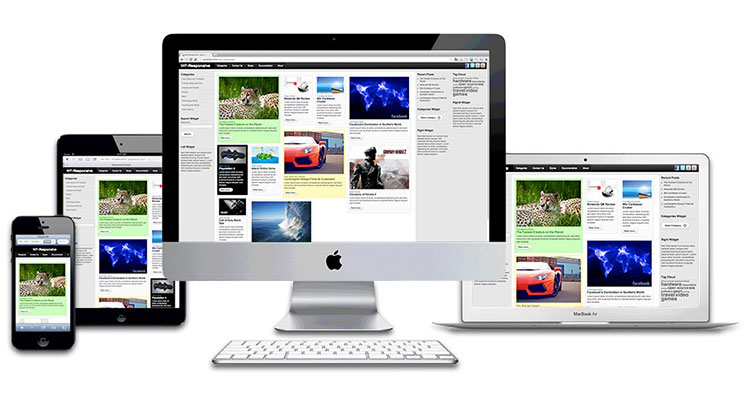
This is a responsive WordPress theme. This means it will look good and optimized on all desktop and notebook computers, as well as mobile devices (tablets and smartphones)!
Well parametrized theme
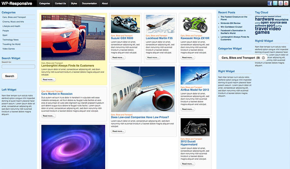
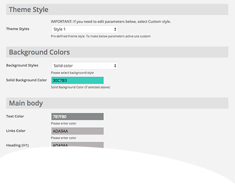
All parameters available in this theme are located on a dedicated page of your WordPress Dashboard. You can access it from Appearance > Theme Options. Each theme has a different set of options related to font and background colors, widths of the elements and features that can be enabled or disabled. From the Theme Options panel, you can select the active color style of the theme or create your own color combination.
Demo Installer
This theme is shipped with demo data. If you follow our simple instructions and install the theme with demo data, you will get a pixel-perfect copy of our demo site.
Always Up To Date
All themes found on this site are tested thoroughly using the latest WordPress version. Any discovered incompatibility issues will be fixed as soon as possible.
Support That Cares
Our products are well-documented, but if you run into the problems with theme installation or usage, simply post your question and our support staff will help.
Valid HTML and CSS
This theme is based on a clean and valid HTML and CSS code. We tested it using the W3C validation tool to make sure it’s 100% free of errors.
Top Menu
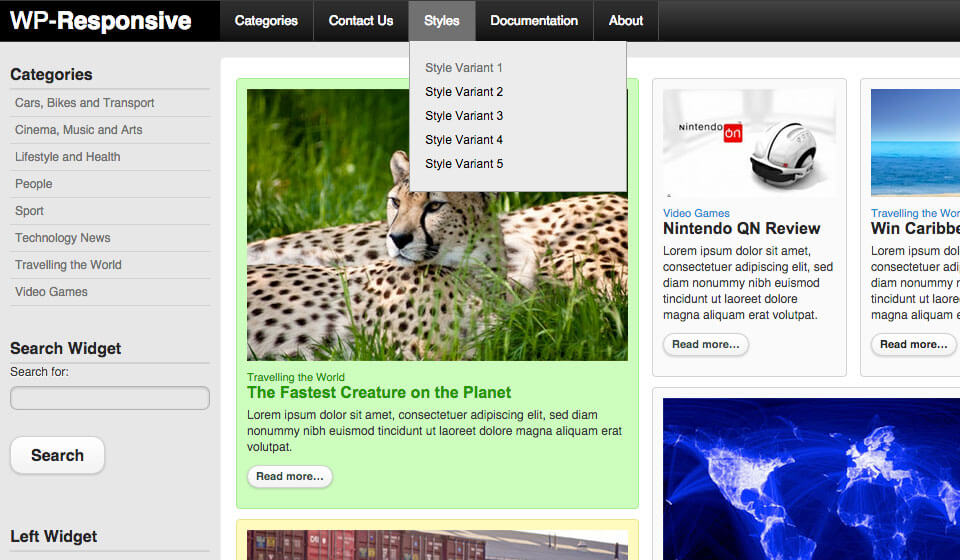
This theme has integrated the top menu script with support for multiple levels. Sub levels are displayed as drop-down panes. The menu script is based on jQuery.
Easier Localization
This theme is shipped with sets of .mo and .po files that can be used to translate the theme. Also, the theme works with RTL languages.
Plugins Included
All the plugins that you can see on the demo are included in the price. If you install the theme with demo data, all plugins will be installed as well.
7 Widget Positions
This theme contains a lot of positions where you can place your WordPress widgets. The detailed “map” of all widget positions is available from the theme options panel.
