How Can Responsive Upscaling of E-commerce Optimize User Experience
Responsive design has become an important aspect of eCommerce websites. Though there are multiple aspects that revolve around the responsive design technology, however a seamless browsing experience is something that counts to be of high significance. There are so many industries that have already adopted the responsive design approach, however, the eCommerce industry is one that has not yet picked up this approach.
Based on the statistics that discover 75% of eCommerce sales being processed on mobile devices, it has become imperative for eCommerce store owners to utilize responsive upscaling. Responsive upscaling is the process that helps to create custom experiences for users using large screens.
Responsive Upscaling For Ecommerce Large Screen Optimization
This technique is all about utilizing the extra space to offer users meaningful browsing experience. In responsive upscaling, the extra space offered by large displays can be used by either adding extra content or by redesigning the extra space.
It is important to ensure that your eCommerce website makes use of all the space available on a large screen. This will help optimize the website for the screen it is being displayed on. If the content on your website is optimized for standard screens and below, you will notice a lot of white space on either side of the product listing page. There are many eCommerce websites that showcase the content according to pre-determined and aesthetic inspired product vertical. In this situation, visitors will be able to view enlarged thumbnails that will help them know about the product accurately.
How To Make Use Of Extra Space: Basic Principle Behind Responsive Upscaling
There are multiple methods in which one can plan to optimize an eCommerce website for larger screens. Let us see how:
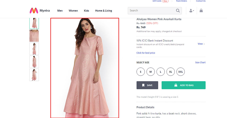
Large product images
The use of large product images not only helps offer better visibility but also allows them to inspect the product in greater detail. The thumbnail size is increased, which, in turn, maximizes the amount of visual information conveyed.
Shortcuts to header and footer
Account and order links for already signed-in users along with customer support and FAQ links can be inserted directly on the homepage. These links should be made easy to reach out from their original destinations that are located within header menus. In the case of larger screens, these shortcuts can easily be accessed from the homepage.
Content will stick to the page but displayed differently. The way content is presented will offer an increased user experience on a larger screen.
Use of extra product columns
Another enticing way to use the extra screen is by restructuring the products so that they can be displayed across additional columns. This, in turn, leads to an increase in the number of products that can be viewed on the screen. A shopper will go from just viewing 5 products to seeing twelve.
With the help of this approach, users can greatly optimize product list views on a large screen. However, it is important to do it wisely. If there are a maximum number of product columns, the grid will become increasingly complex to scan because website users will find themselves loaded with huge information. This might cause problems while they move their eyes from one line to the other.
For the same reason, it is important to limit products in the range of 6-9 columns. This assures that shoppers do not get lost in all the information.
Client support and order summary
During the process of checkout, a lot of horizontal space is left untouched. This results in usability issues while checking out. On large screens, this area of white space can be utilized by placing an order summary or by inserting quick links to the client support. The order summary is one important element that needs to be constant throughout the checkout process and also serves as a reminder about the number of items a customer is about to own.
Client support functionality can also be placed in a different position from the normal footer location. This way, you will make it easier for customers to connect to the support team while facing any usability issues in the checkout process.
Summary of the product page
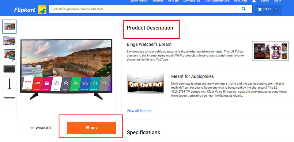
In general, product pages are designed to be very long and arduous. The overall content in them includes images, specifications, descriptions, FAQs, customer reviews and so on. The detailed and useful information is always better as long as it is of great quality, highly reliable and accurate.
In the end, it is important to add product summary within the extra space on a large screen to keep the “buy” button within the reach of users.
Similarly, it is also important to make sure that the “Add to Cart” button remains easily accessible to users.
Recently viewed products
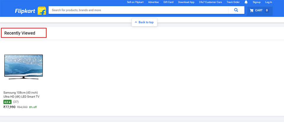
Allow users to navigate easily from one product to the other. This will help them reach the final products easily. The promotion of product categories can also be of great help. There are instances when a user could not decide about the products they would like to have and in the end, they will either browse other products or leave the website. To compel users to switch to other product suggestions on the website, it is important to compile a list of recently viewed items just above the fold on the same page.
Wrapping it Up:
It is quite significant how eCommerce website owners optimize the web design for larger screen views. There are many other different elements that can be placed along with this content to have a wonderful eCommerce design that is accessible on all screen sizes. The right placement of these elements will definitely help optimize the user experience.
Author bio:
Nola Arney is an experienced and skilled developer employed at HTMLPanda. She enjoys exploring the latest development technologies and taking new challenges. Apart from being a developer, she has contributed towards all high-quality write-ups and also loves to share her development expertise with the readers.